Baotic
Logo & Packaging Redesign
2017 Glasgow
Logo & Packaging Redesign
2017 Glasgow
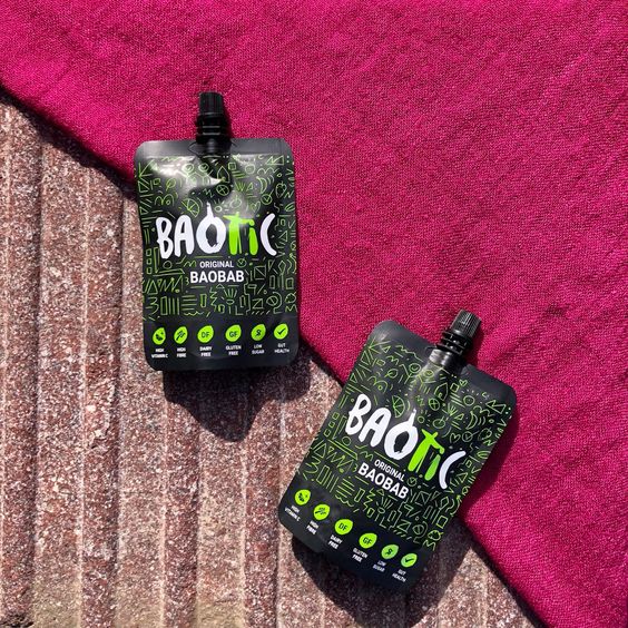
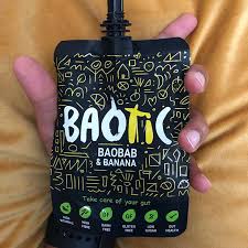
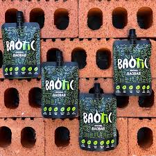
Redesigned logo and packaging for Baotic – Baobab Drink. By using the organic form of its dedicated font, I tweaked a few glyphs, creating a hidden meaning within the letters O-T-I. The story of Baotic is a story of the Baobab tree and its undeniable health benefits, but more than that, it's about a vital community. Picking baobab fruits, processing them, and teaching the younger generation in Gambia how to care for the trees and common goods – this knowledge has been passed down through generations in Africa.
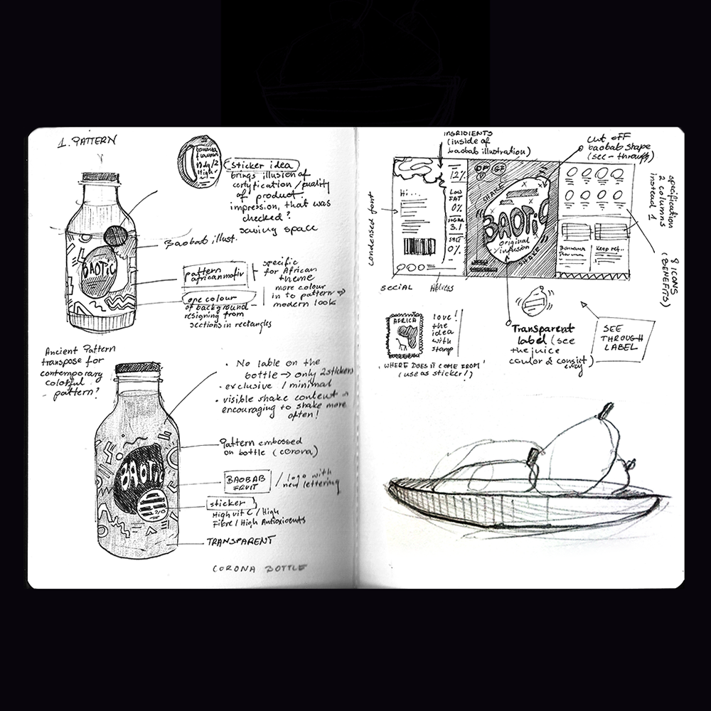
I wanted to encapsulate that story within the logo structure; the letter O represents the baobab fruit, the letter T represents an adult, and the small I represents a youngling guided by an older person.
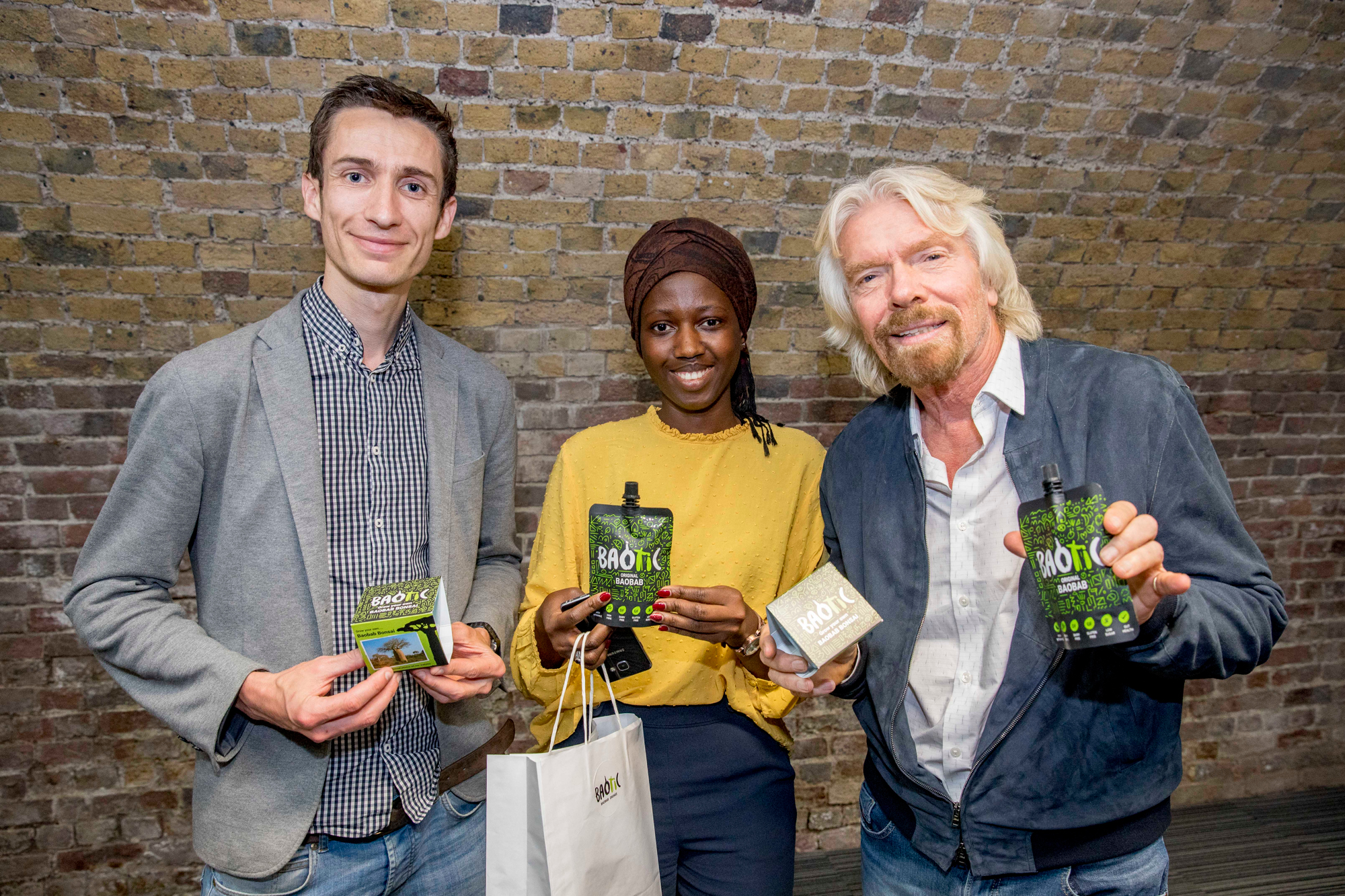
The following images show the lovely founders of Baotic drink - Paul and Isatou, next to Richard Branson.
I wanted to encapsulate that story within the logo structure; the letter O represents the baobab fruit, the letter T represents an adult, and the small I represents a youngling guided by an older person.
The following images show the lovely founders of Baotic drink - Paul and Isatou, next to Richard Branson.

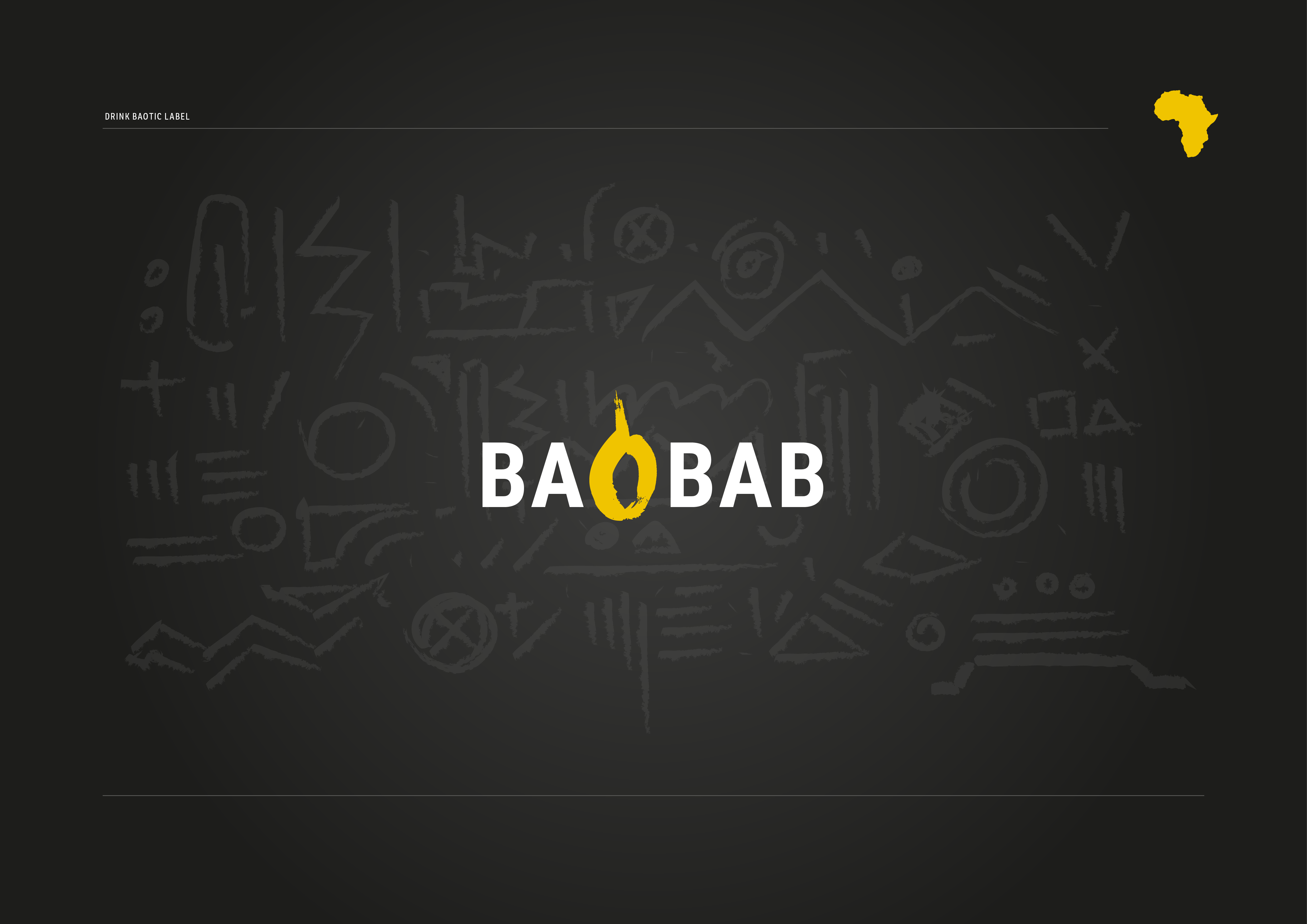
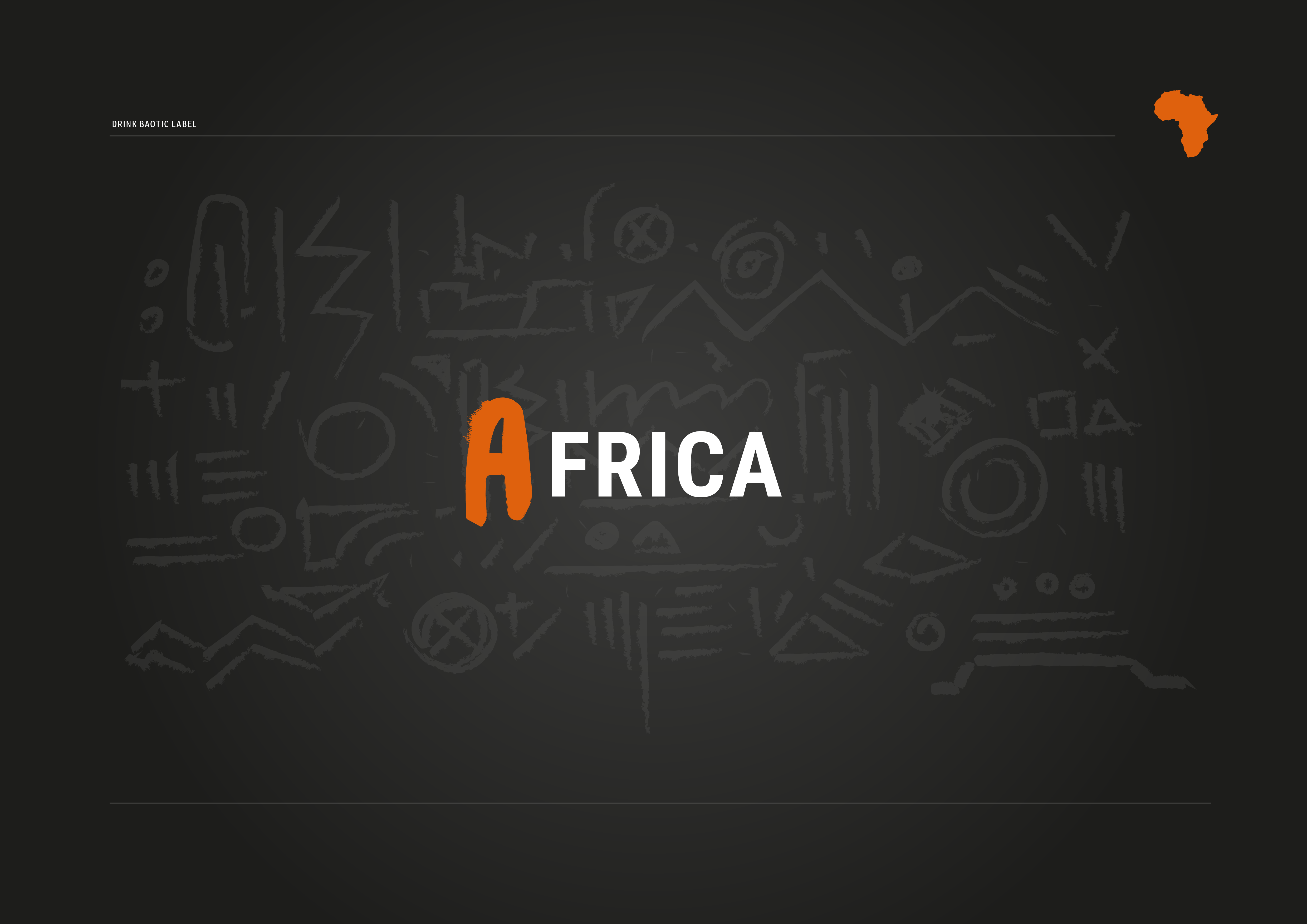
BAOTIC STANDS FOR:

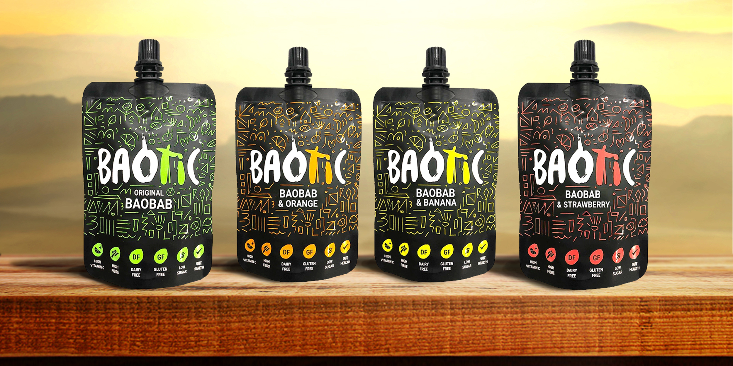
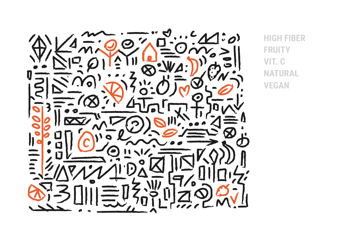
The pattern for the labels was inspired by primal African tribe patterns.
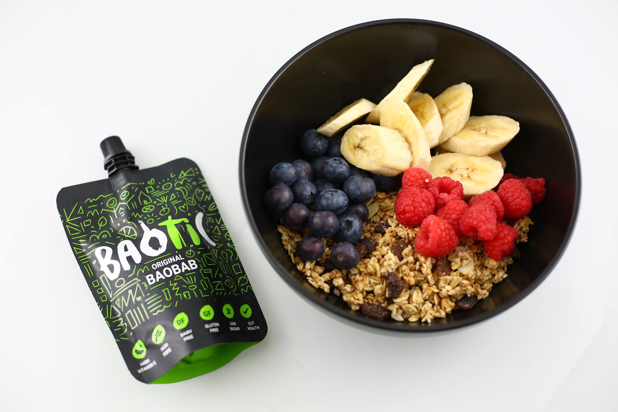
I decided to hide some of the nutrition values inside by incorporating them as tiny icons:
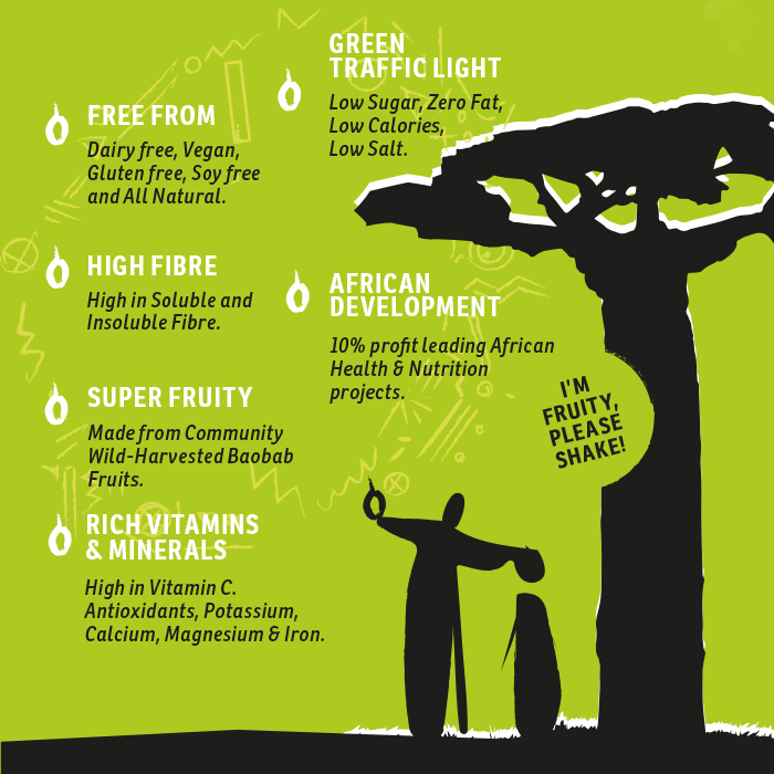
Baobab… its all about the Super-Fruit!
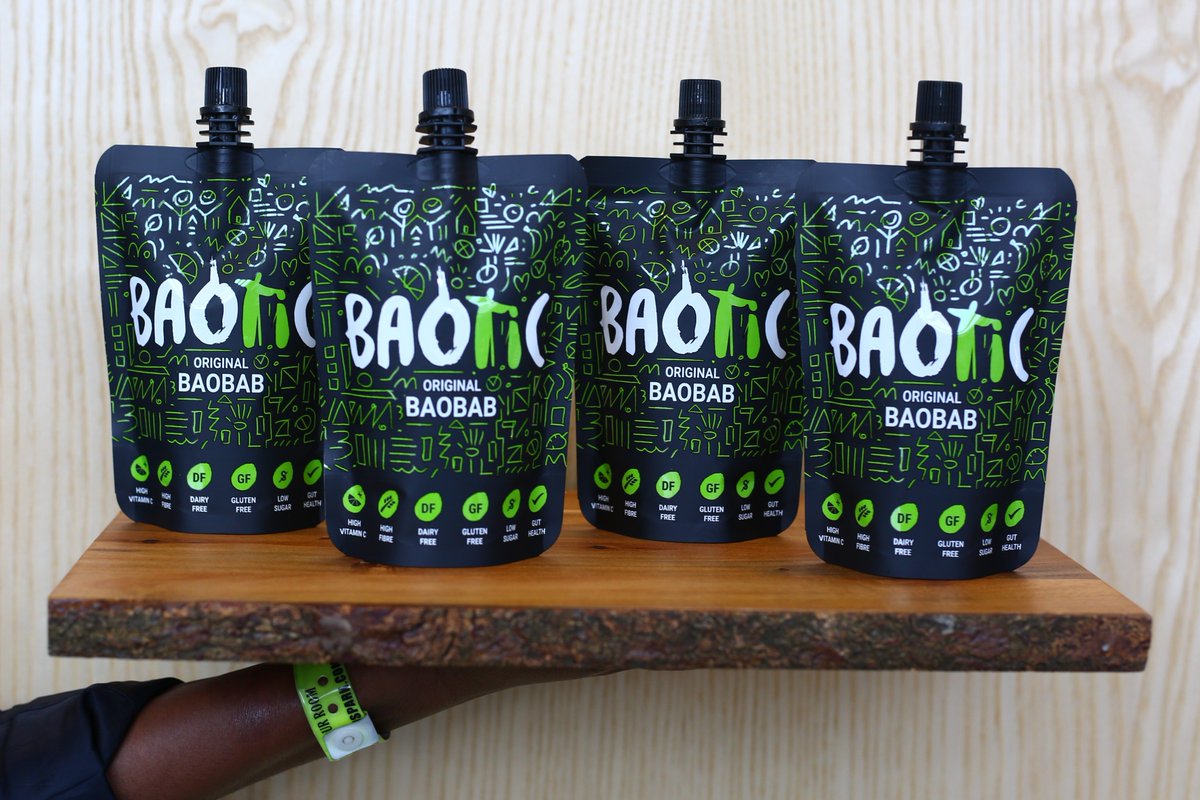
All the benefits of baobab were placed on the side of the 4-pack packaging, positioned next to falling baobab fruits created from the letter 'O'.
Old Logo was slightly tweaked in order to introduce symbolism behind tradition – passing knowledge of harvesting through one generation to another. The idea was communicated by realtion beetween letter T & I.

Baotic Community Online: