Baotic
Logo & Packaging Redesign
2017 Glasgow
Logo & Packaging Redesign
2017 Glasgow
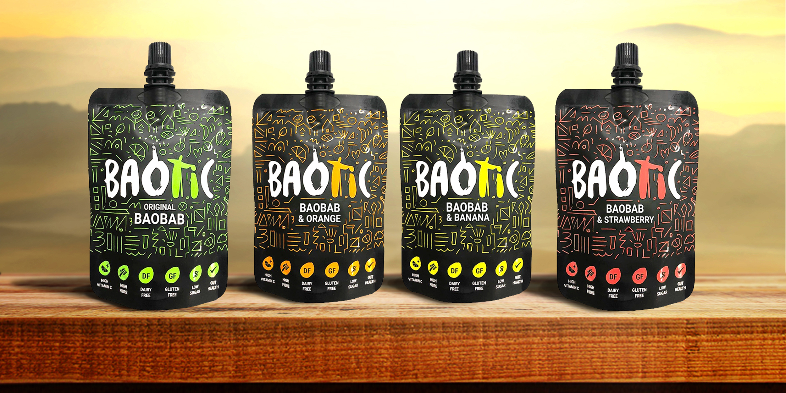
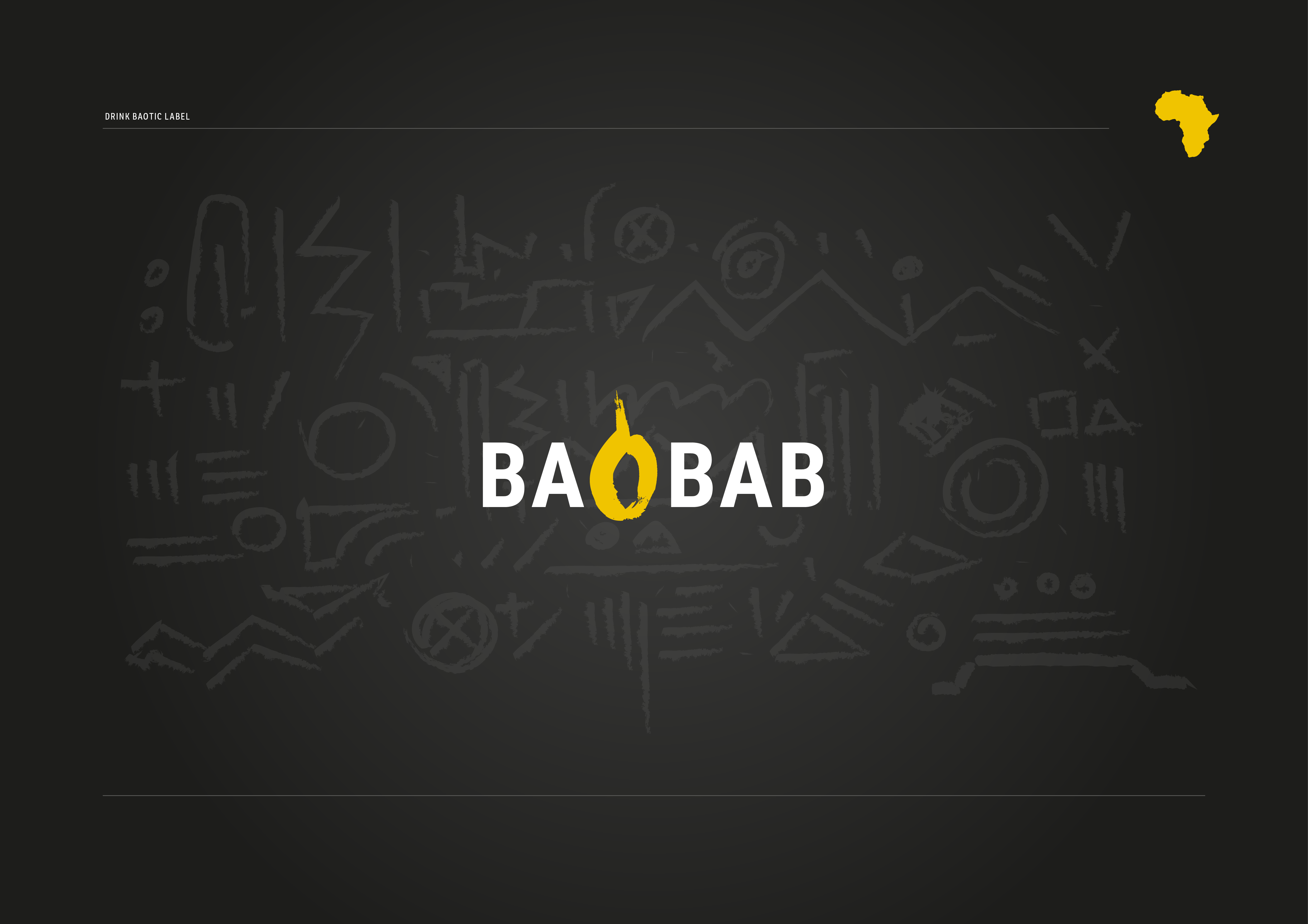
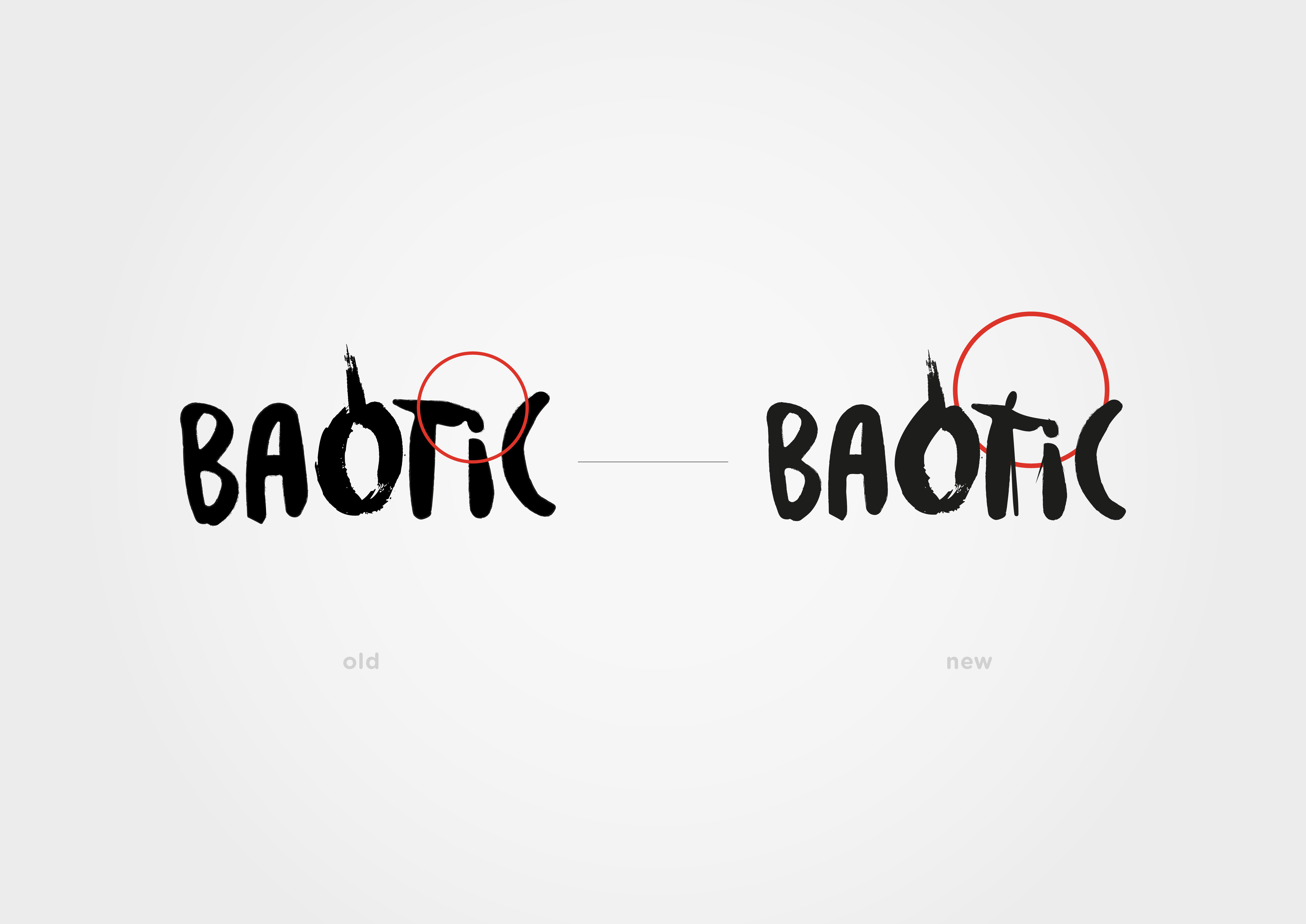
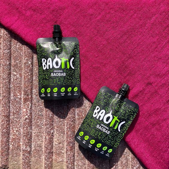
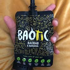
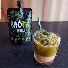
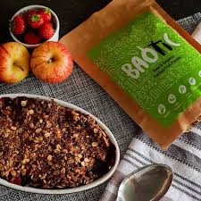
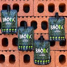
Redesigned logo and packaging for Baotic – Baobab Drink. By using the organic form of its dedicated font, I tweaked a few glyphs, creating a hidden meaning within the letters O-T-I. The story of Baotic is a story of the Baobab tree and its undeniable health benefits, but more than that, it's about a vital community. Picking baobab fruits, processing them, and teaching the younger generation in Gambia how to care for the trees and common goods – this knowledge has been passed down through generations in Africa.
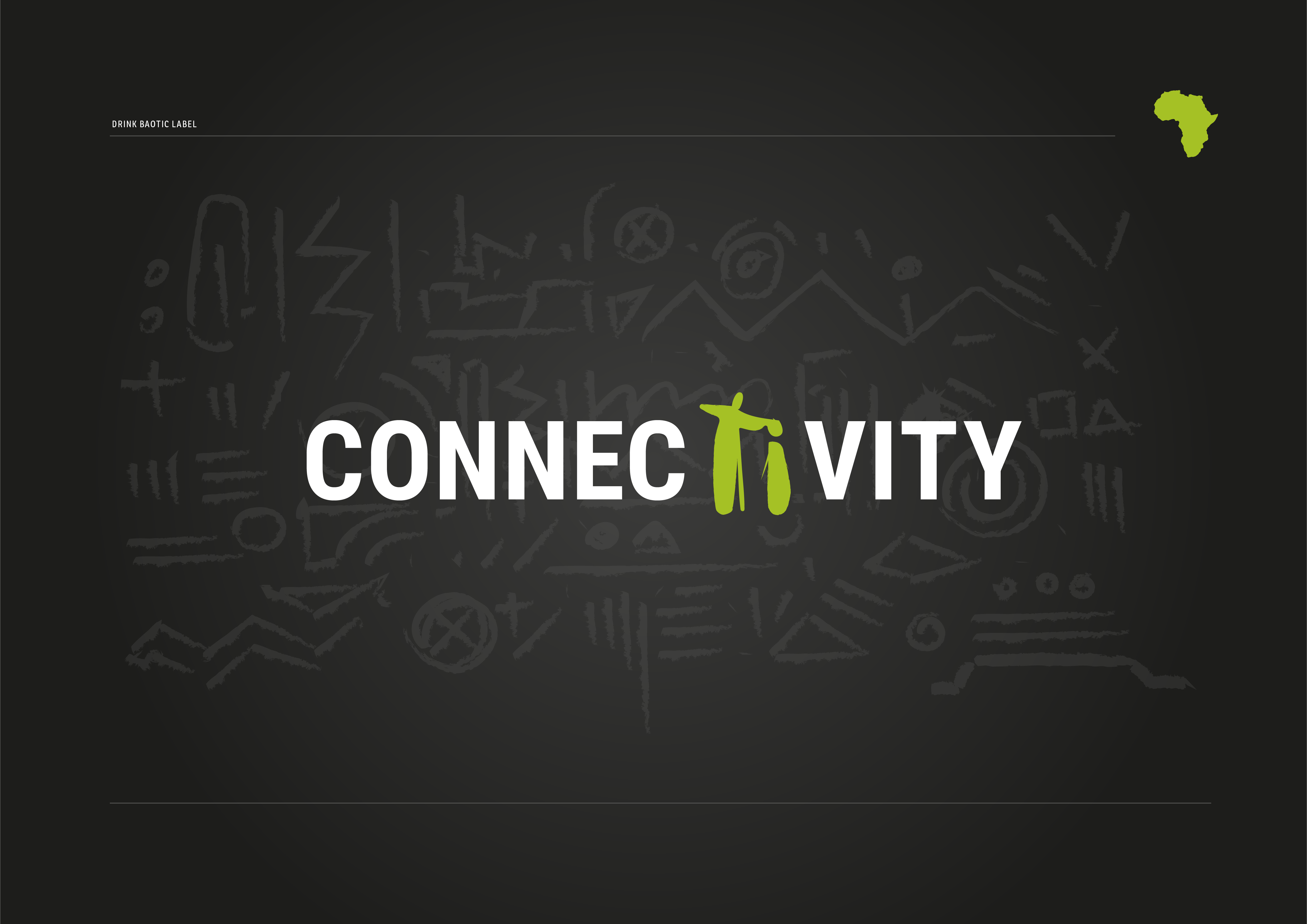
I wanted to encapsulate that story within the logo structure; the letter O represents the baobab fruit, the letter T represents an adult, and the small I represents a youngling guided by an older person.
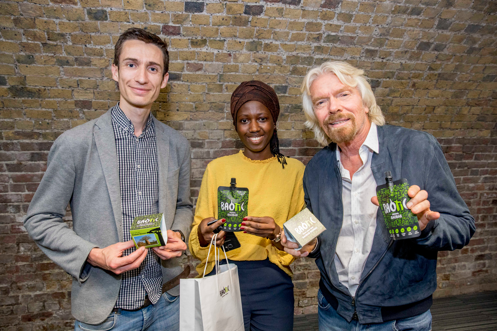
The following images show the lovely founders of Baotic drink - Paul and Isatou, next to Richard Branson.
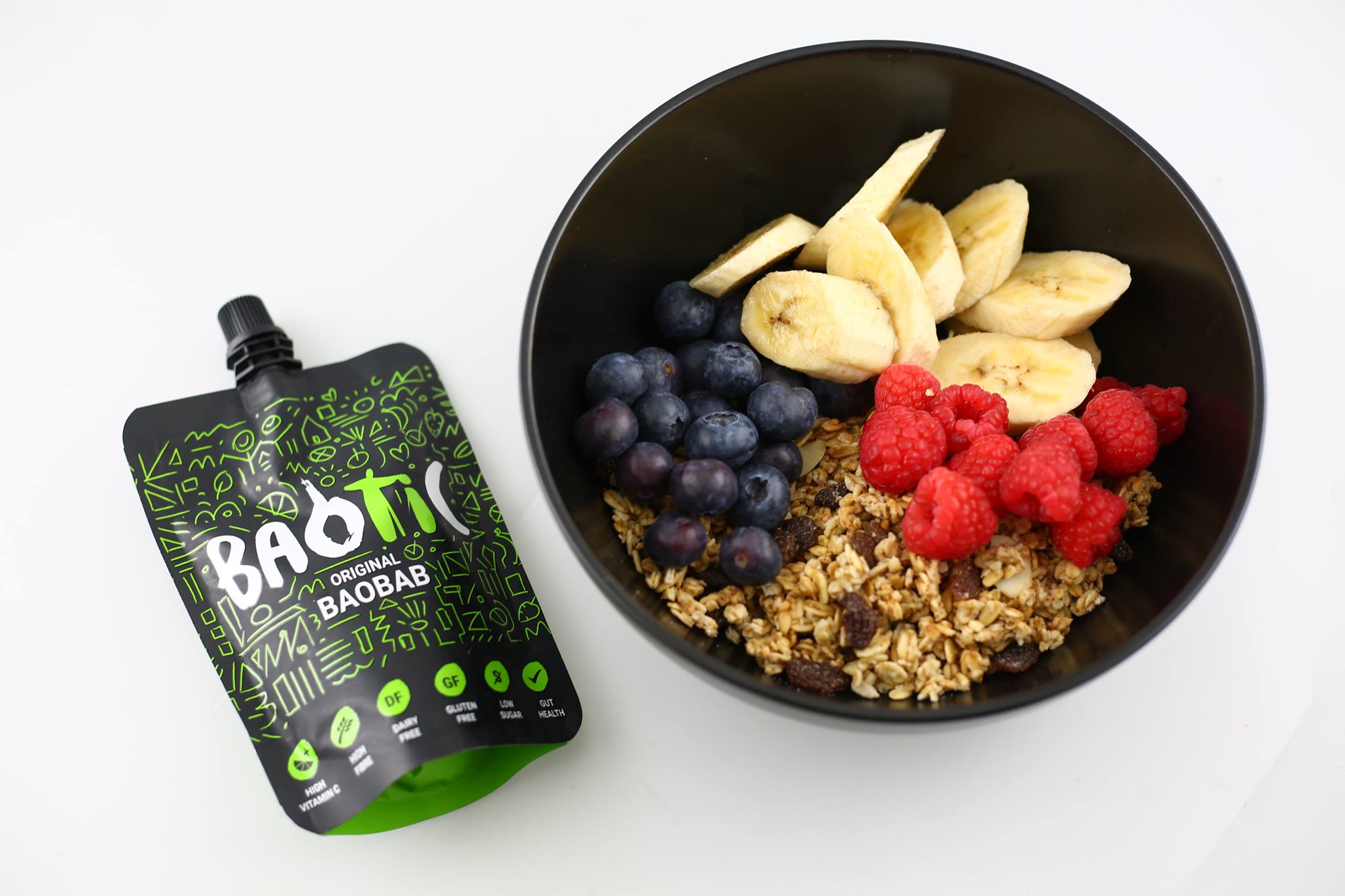
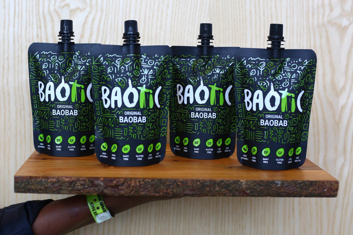

BAOTIC STANDS FOR:
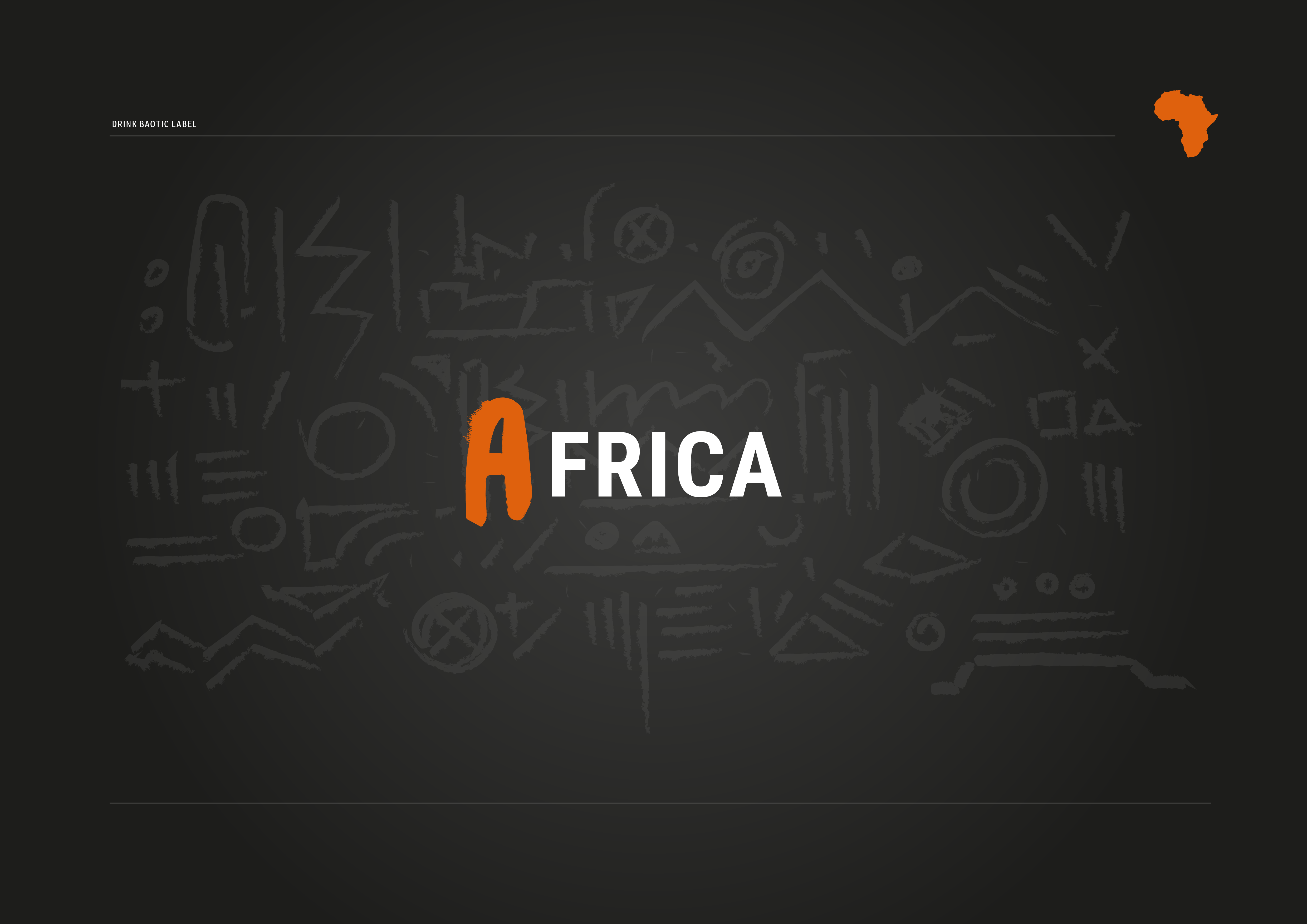
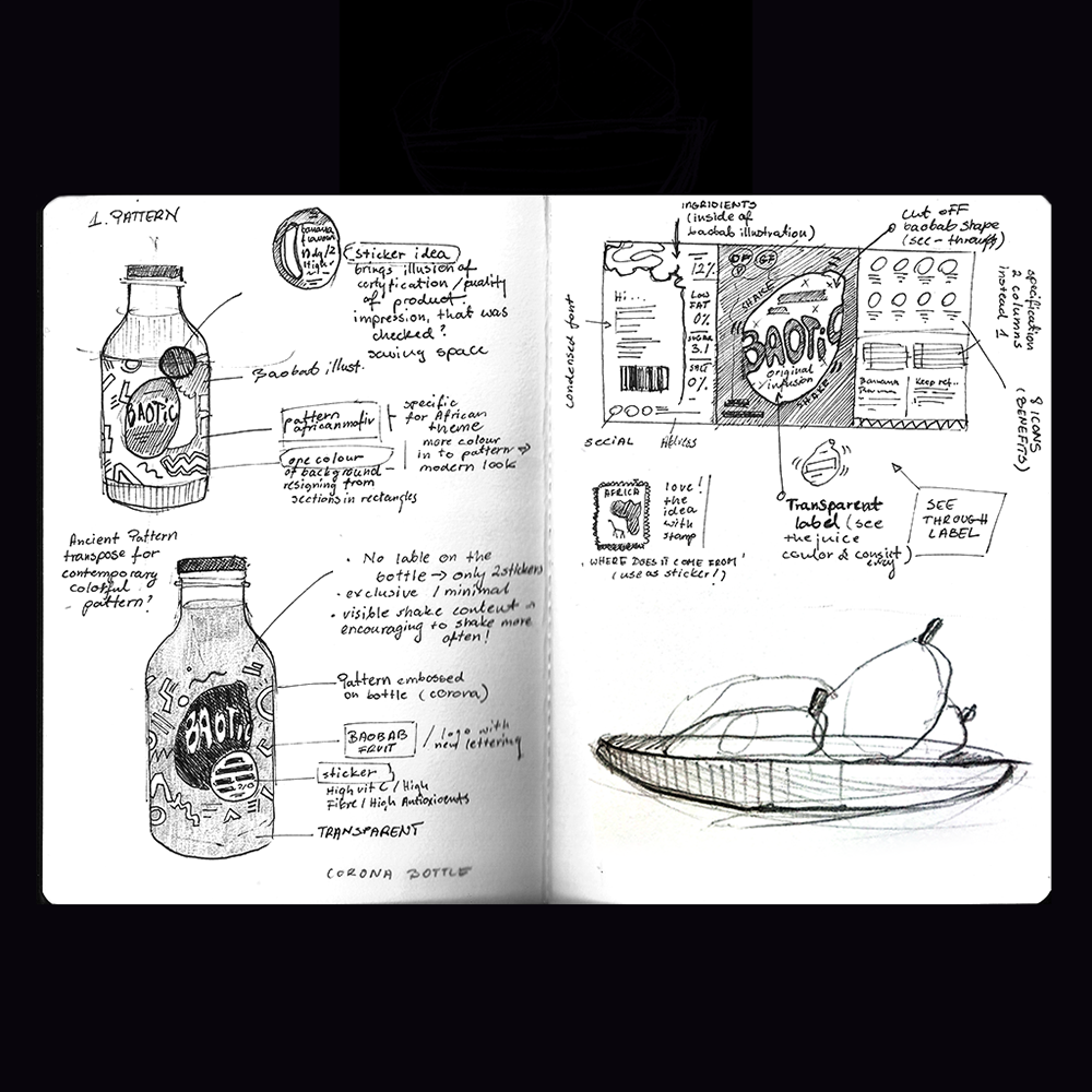
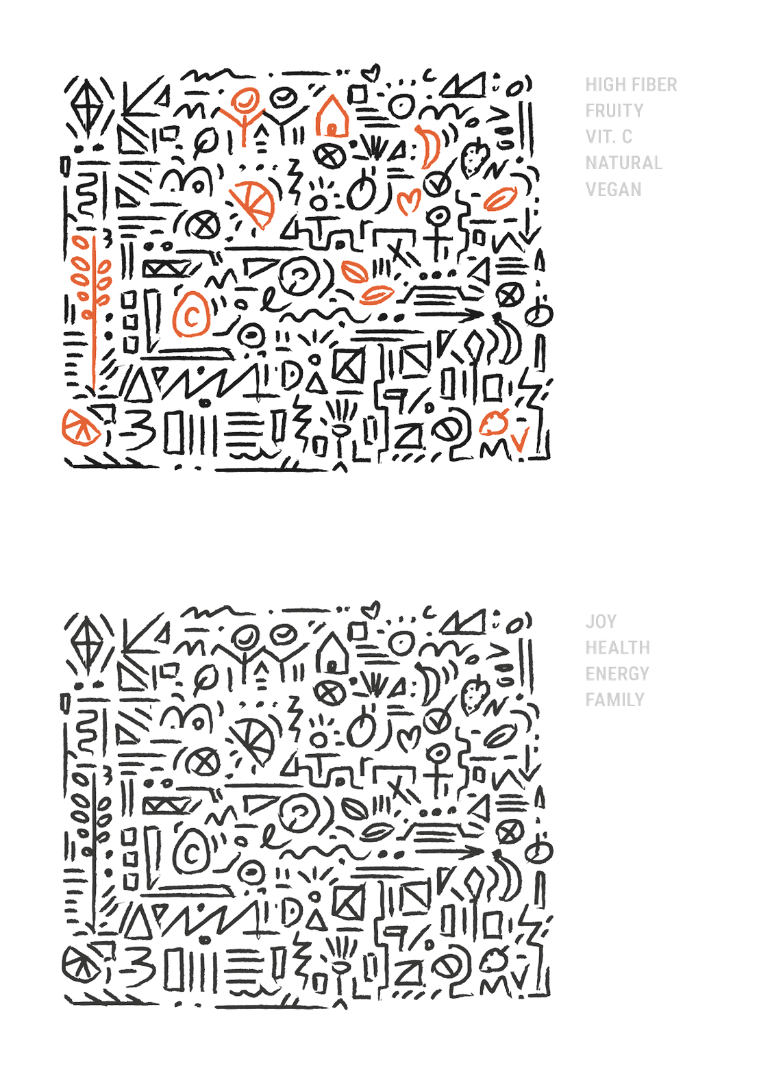
The pattern for the labels was inspired by primal African tribe patterns.
I decided to hide some of the nutrition values inside by incorporating them as tiny icons:
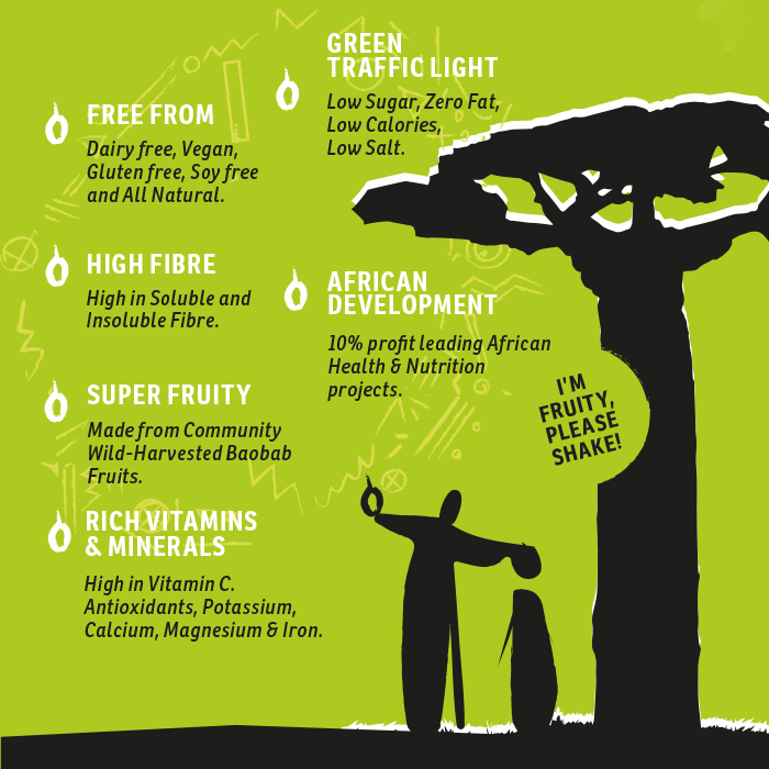
Baobab… its all about the Super-Fruit!
All the benefits of baobab were placed on the side of the 4-pack packaging, positioned next to falling baobab fruits created from the letter 'O'.

Old Logo was slightly tweaked in order to introduce symbolism behind tradition – passing knowledge of harvesting through one generation to another. The idea was communicated by realtion beetween letter T & I.

Baotic Community Online:
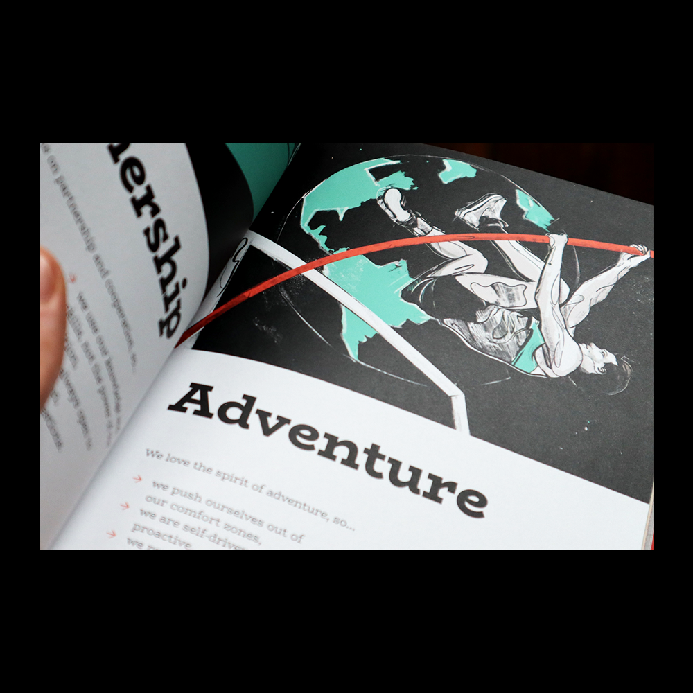
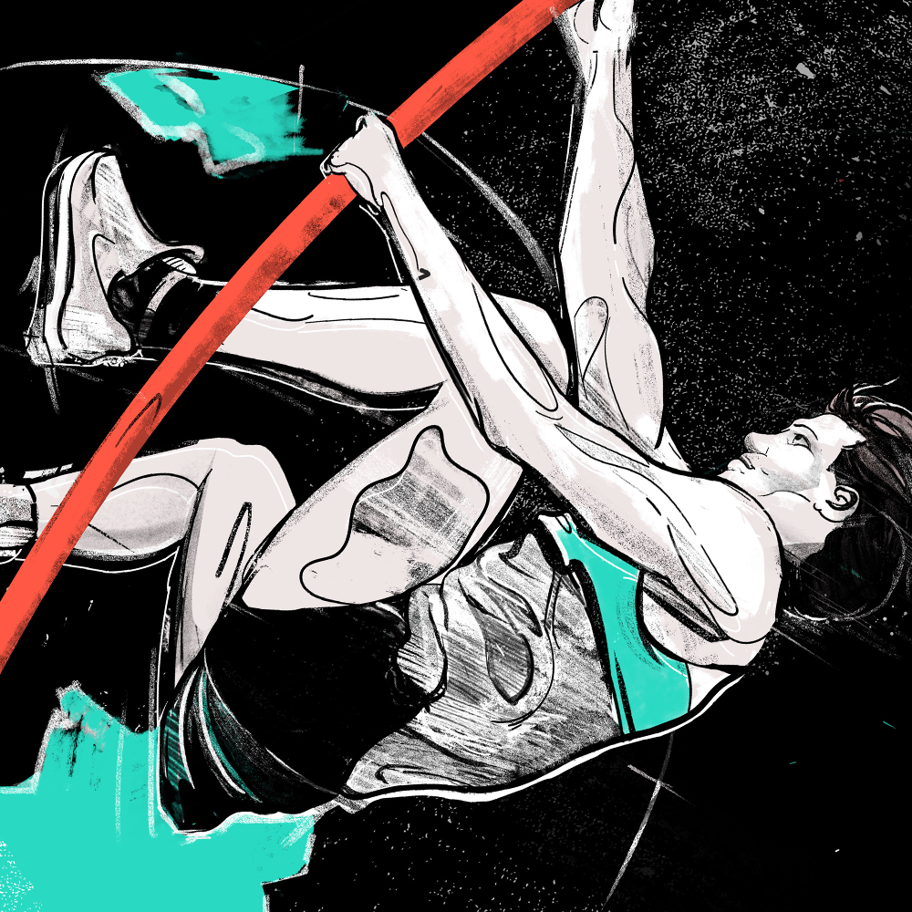
Adventure
Award Winning Illustration
2019 Poland
Award Winning Illustration
2019 Poland
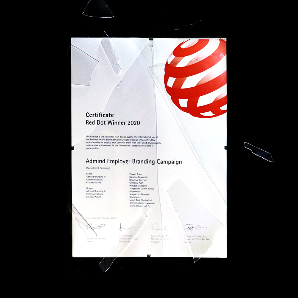
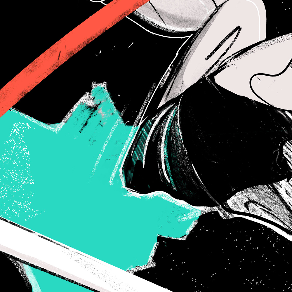
Adventure illustration was a part of a bigger Admind Employer Branding Campaign that won a Red Dot in a [Recruitment Campaign] catgory. It illustrates one of the few Values that Admind Agency represents.

Zmiany
Identity, Animation, Landing Page
2020 Poland
2020 Poland
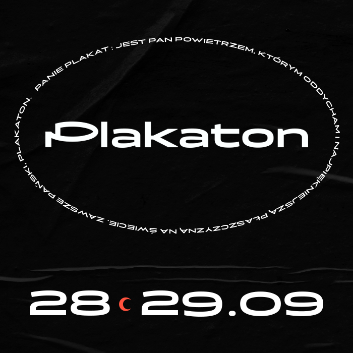
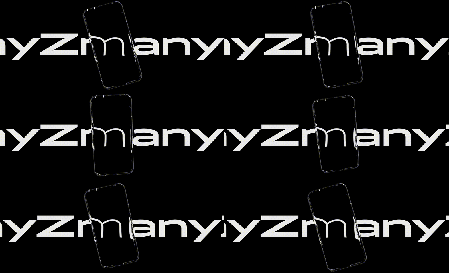
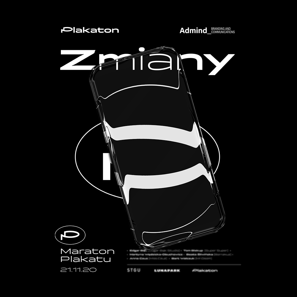
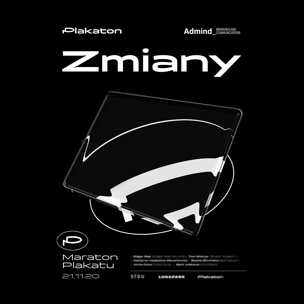
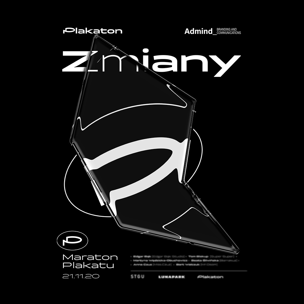
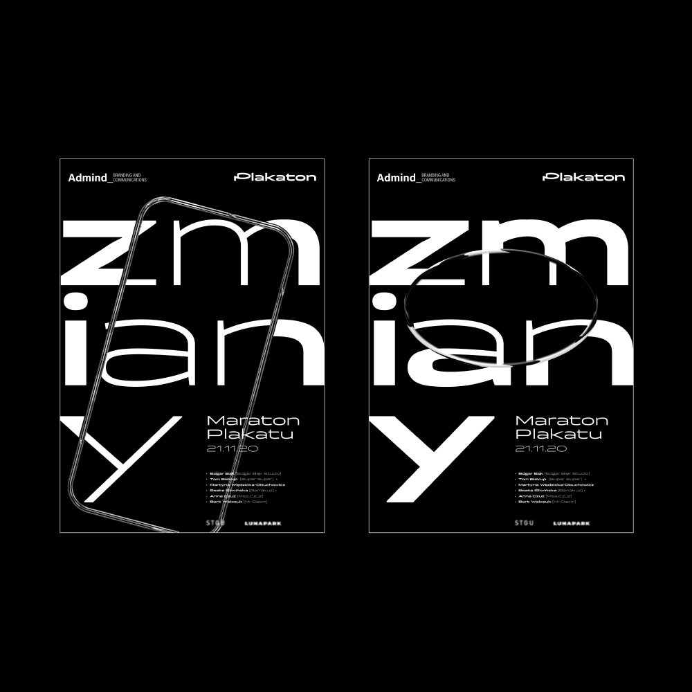
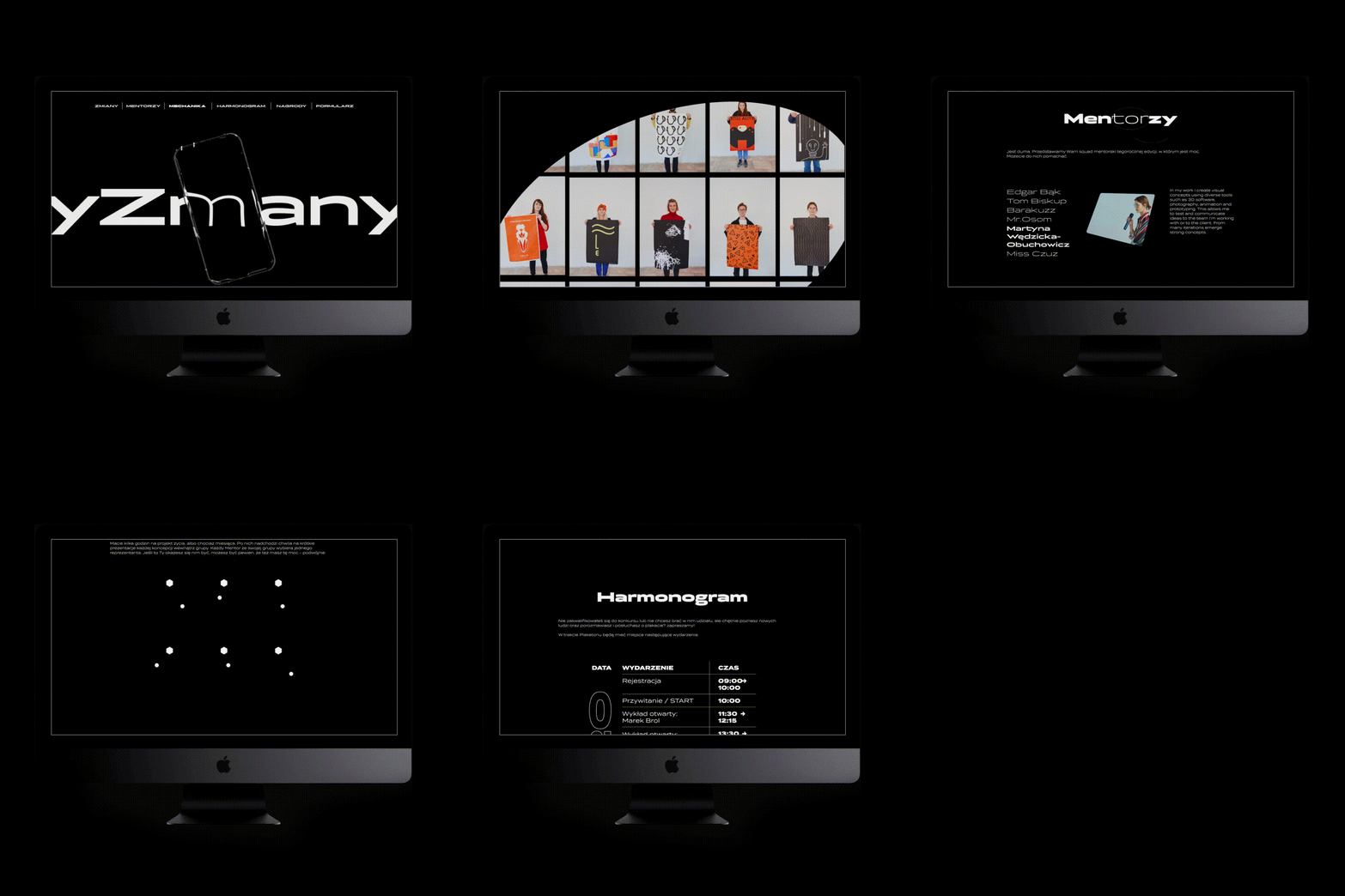
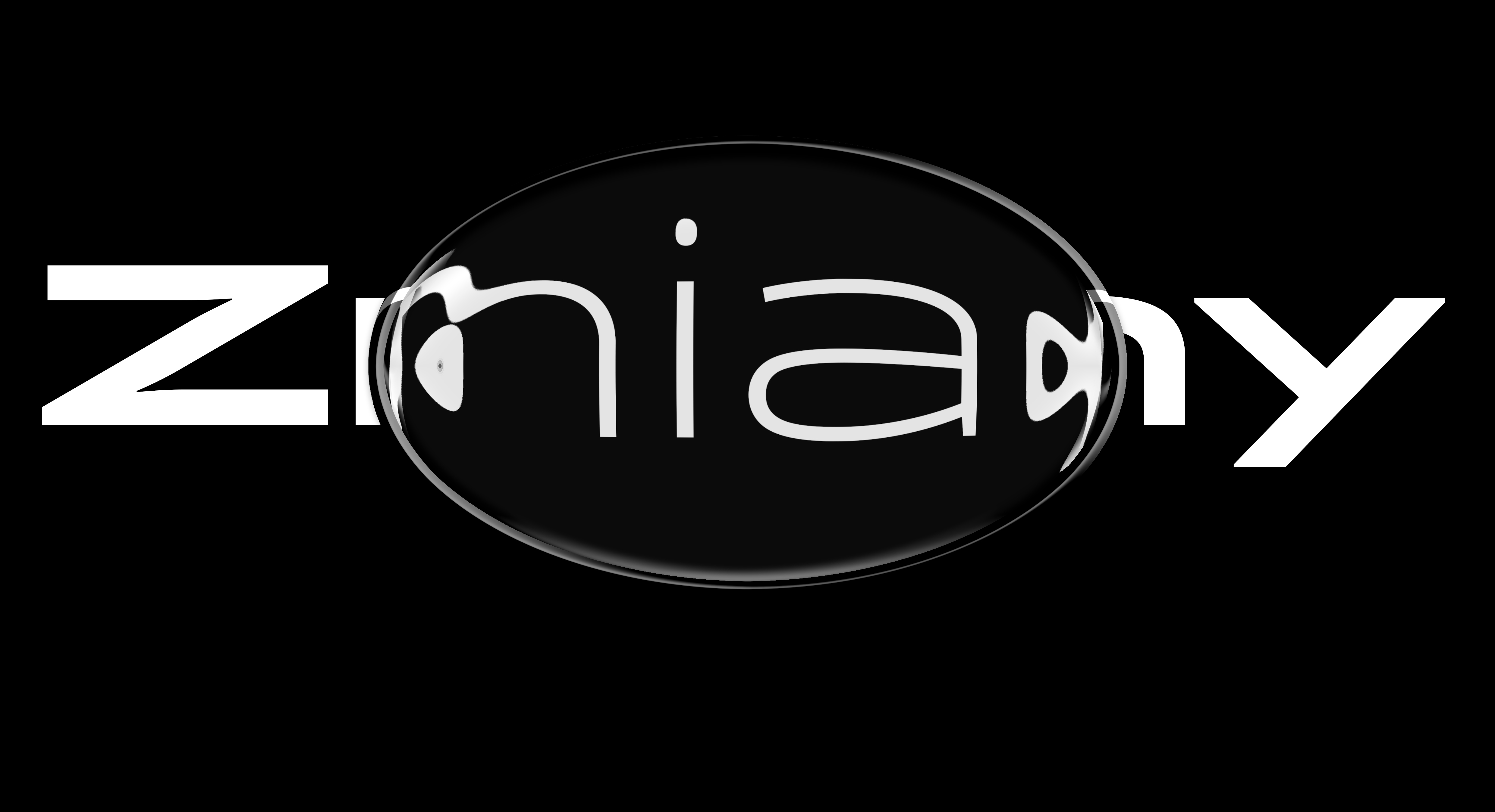
Visual Identity for Zmiany – Plakaton (poster marathon) second edition. Unfortunately, due to the pandemic situation this project never saw a daylight. I designed posters and animations showing the idea of ‘changes’ (main theme of the event) by deforming plakaton’s primary logo through different digital devices.
This series of three black and white posters shows the principal devices that are nowadays responsible for bringing attention to posters. The main platforms for exhibiting posters today are not galleries or the streets, but social media viewed through the lens of electronic devices. Additionally when designing posters I still wasn't sure if the festival will take place in real location due to Covid, or just in online format (which would fit nicely with identity concept).
Final solution is pointing toward digital surfaces that work as canvases/containers for nowadays posters. Work for @admindagency.
" fameborder="0" allowfull
screen>

Logos Collection
(2011 – 2024)
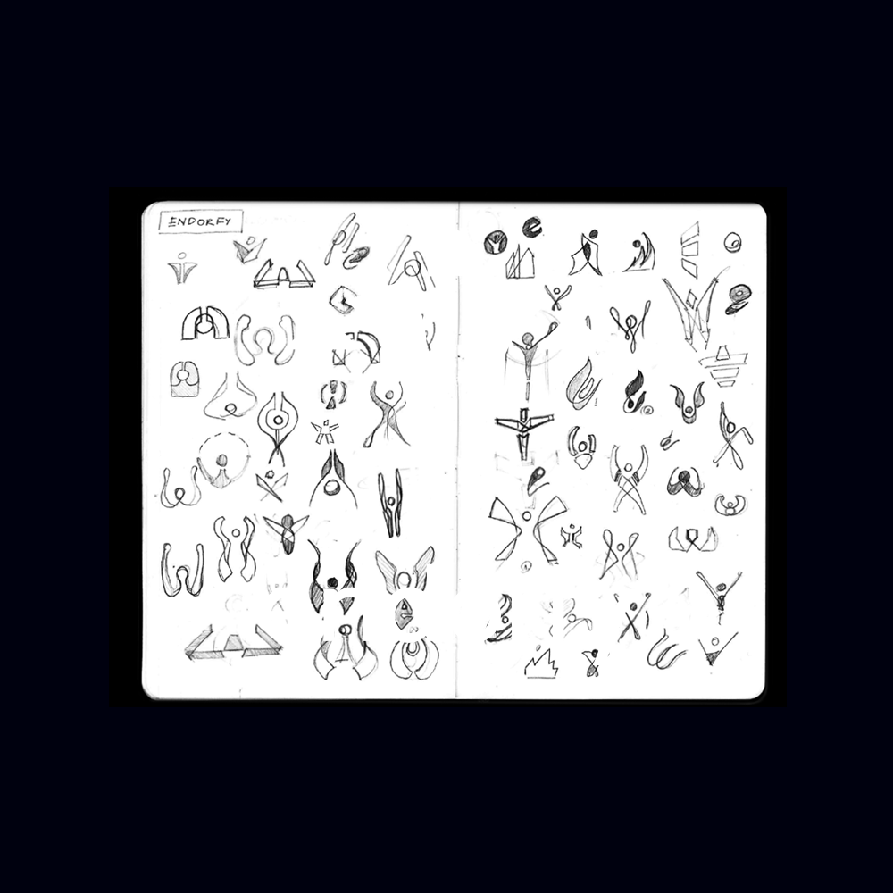
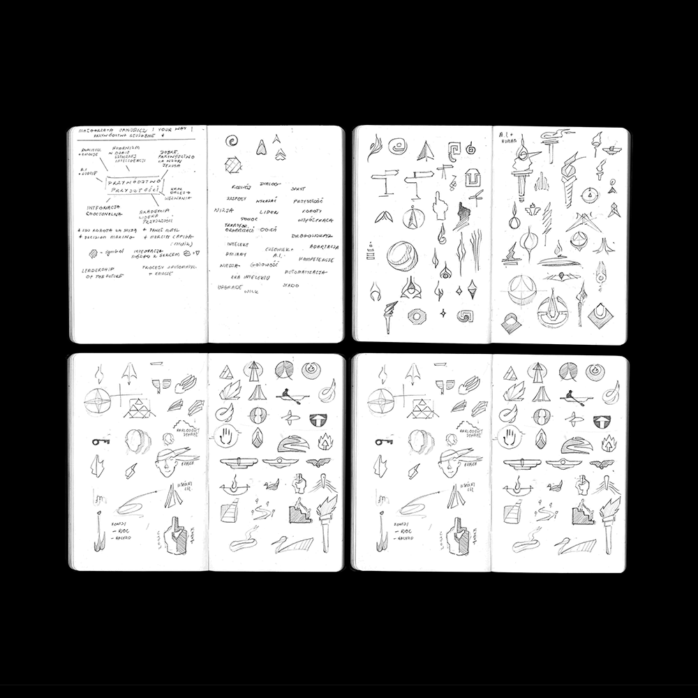
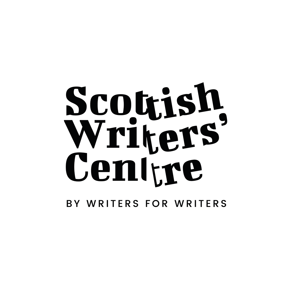
With a keen eye for detail and a passion for storytelling, my logo designs seamlessly blend aesthetic appeal with narrative depth, ensuring each brand stands out with its own unique story. Few examples below.






Plakaton
Event Design, Identity
2019 Poland
Event Design, Identity
2019 Poland
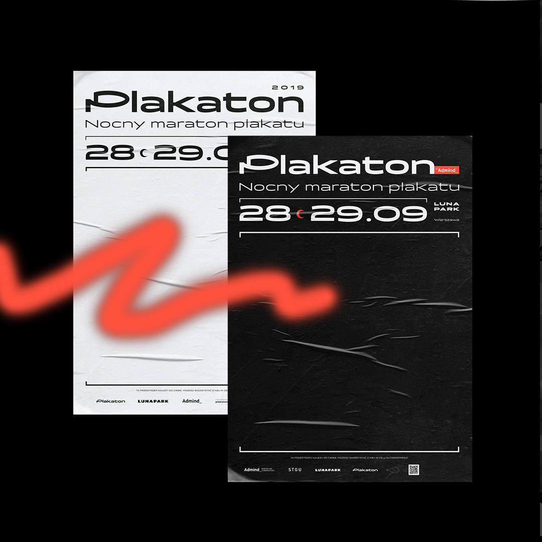
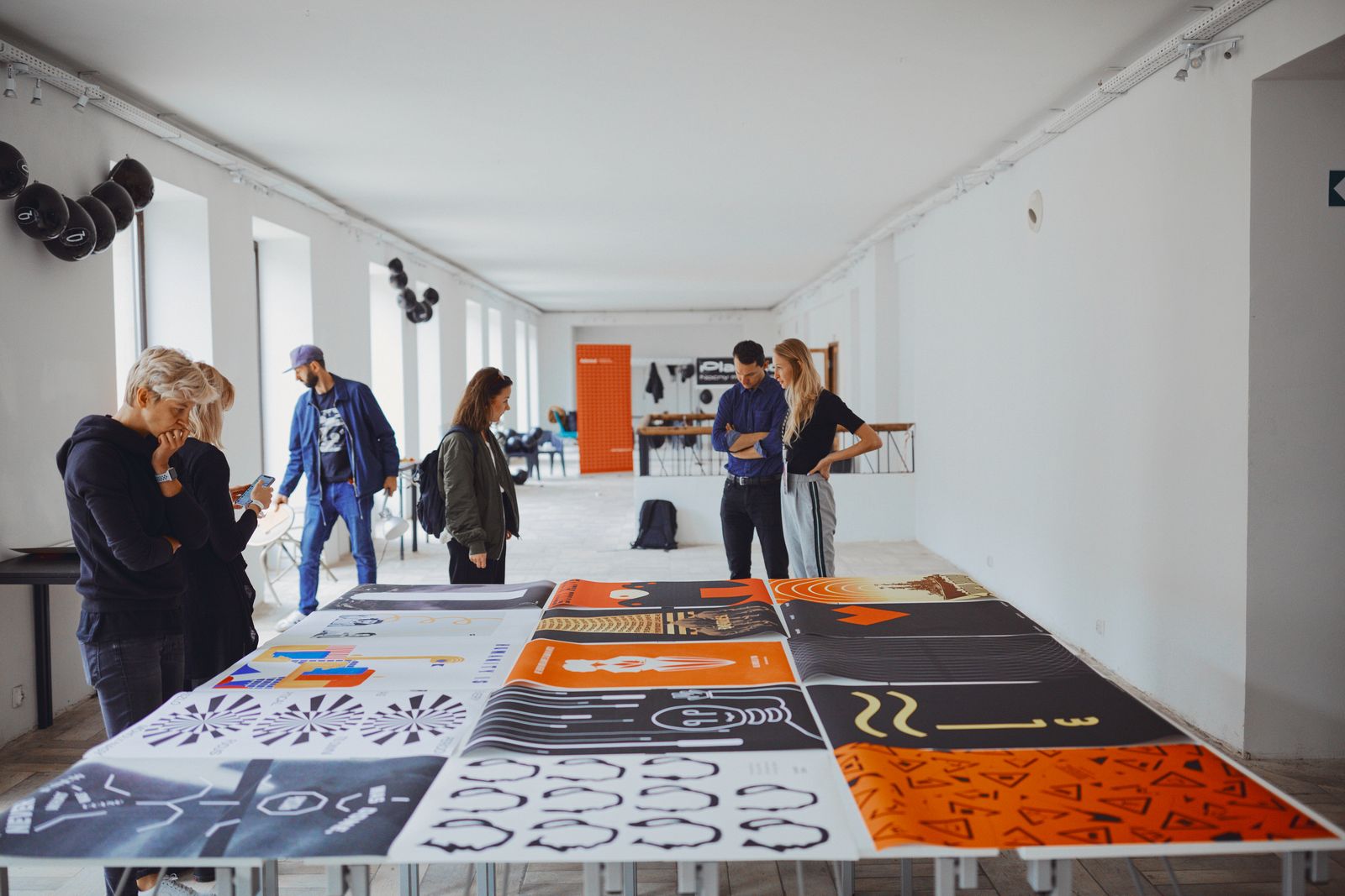
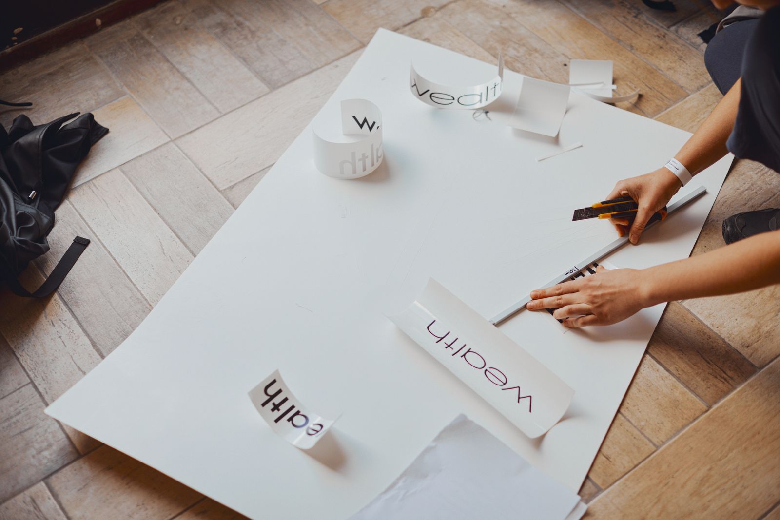
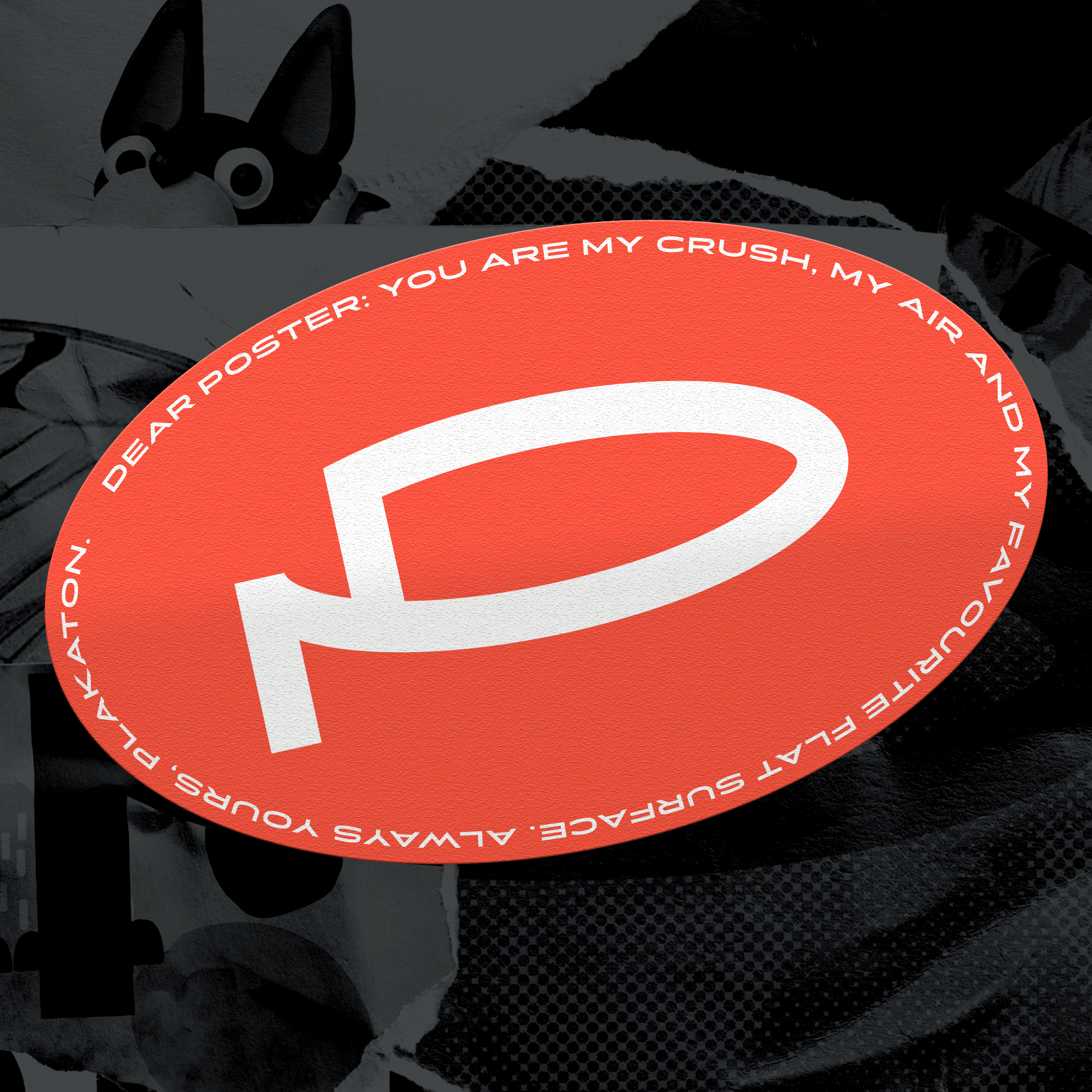
One of my biggest highlights from year 2019 was designing visual identity for Plakaton - an overnight poster marathon organised by Admind Agency. Plakaton is a new cyclical event on the map of Polish design. During the event talented designers worked on a beautiful poster designs with renowned mentor artists. It was a fantastic opportunity to demonstrate designers creativity, and also to
celebrate polish poster condition as its best!


